Glossy vs Matte Photos: Choose for the Way You Display Them
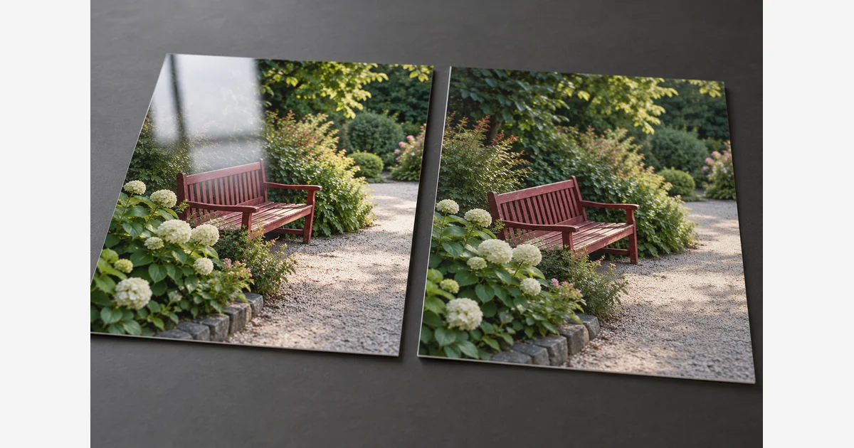
Choose glossy photos when you like a smooth, shiny surface and can control reflections. Choose matte when a lower-glare surface better suits the display or viewing conditions. For a useful middle ground, compare the lab's lustre, satin, or semi-gloss options with a small sample order.
There is no finish that is automatically best for every portrait, black-and-white image, or family album. The final appearance depends on the particular paper, printing process, lighting, and any glazing in front of the print. Use the same image and intended viewing conditions to make the decision.
Glossy vs matte photos: what changes?
Glossy and matte describe surface appearance. Glossy surfaces can produce a distinct reflection of a light or window; matte surfaces spread that reflection more broadly. Matte does not mean that the print produces no reflection or that lighting no longer matters.
Canon's digital printing guide distinguishes glossy, semi-gloss, matte, and fine-art surfaces and explains that paper choice affects the impression of the image. Its product examples also show why “matte” should not be treated as one uniform material.
| Finish | What to look for | A practical tradeoff |
|---|---|---|
| Glossy | A smooth shine; reflected light can obscure part of the image at certain angles. | A pleasing surface in controlled light may be difficult to view opposite a window. |
| Matte | A lower-gloss appearance, which may be smooth or visibly textured. | Reduced concentrated glare does not establish scratch resistance, longevity, or color accuracy. |
| Lustre, satin, or semi-gloss | An intermediate sheen or a textured surface, depending on the product. | Names are not interchangeable specifications; compare the actual supplier's samples. |
Choose the finish for where the photo will be used
| Use | A useful starting comparison | Check in person |
|---|---|---|
| An unglazed print viewed under changing room light | Matte against lustre or semi-gloss | Walk around it and watch whether a reflection hides important detail. |
| A framed print behind glass or acrylic | The same image in your preferred two finishes | The glazing's reflections and the separation between the print and glazing. |
| A family album | Available glossy, matte, or lustre samples in the intended page format | Image visibility through the page, handling, pocket fit, and manufacturer instructions. |
| A small gift or casual set of snapshots | The lab's regular glossy and lower-gloss alternatives | How the recipient will view and store them, rather than only the website preview. |
| A textured fine-art presentation | Named paper samples with the surface and weight you want | Texture in light areas, the paper's white tone, and the impression at the intended size. |
For a frame, choosing matte paper does not remove reflections from the glass in front of it. The National Archives recommends a window mat or spacers to keep glazing away from an original photograph. Check the whole assembly in the display location and use the frame and mat measurement guide to keep important edges visible.
Black-and-white pictures can work on several surfaces. Compare a sample that contains both dark areas and gentle gray transitions. Decide whether the paper supports the effect you want; the subject being monochrome is not enough to choose a finish.
Where do lustre, satin, pearl, and semi-gloss fit?
Treat them as product-family names rather than a single guaranteed level of shine. Canon lists glossy, matte, luster, and semi-gloss papers separately. Hahnemühle's paper collection likewise contains named surfaces across matte and glossy families.
Two labs using the word “lustre” may offer different papers or processes. Ask for the named paper or product, whether the sample represents the finish and print process you will order, and whether a protective coating is included. Do not infer that two products will match because both order menus use “pearl.”
For home printing, the paper must suit the printer, ink, loading path, and selected media setting. Our photo paper guide can help you compare formats and options, but follow the exact paper and printer instructions for the combination you choose.
Run a useful two-finish sample comparison
A small controlled comparison is more informative than comparing two unrelated photographs. You do not need a large test chart to discover whether a window reflection ruins the spot where a family photo will hang.
- Choose one familiar file. Include the details you care about: skin tones, a dark coat, a pale sky, or fine texture. Use the original file rather than a reduced messaging-app copy.
- Keep the output comparable. Order the same size and crop in both finishes, preferably from the same supplier and printing process. Record any automatic image correction or coating.
- Label the back or sleeve appropriately. Record the exact paper/finish and order settings without marking the image surface. Keep the order record if you plan to reorder.
- View them where they will be used. Check the intended light, viewing distance, and angles. Try the relevant album pocket or frame glazing rather than judging only loose sheets.
- Separate the observations. Note reflection, surface texture, visible image detail, and personal preference. Do not turn one result into a claim about all glossy or matte paper.
Download the photo finish comparison log (.txt)
If one sample is unexpectedly dark, pause the finish decision and use the print-darkness troubleshooting guide. Different file adjustments or output settings can make a surface comparison hard to interpret.
Check these details before the full order
Use the print size calculator before ordering and photo-safe storage guidance afterward. Surface finish alone is not a prediction of how long a print will last; the image materials, production process, housing, and environment also matter.
Sources
Frequently Asked Questions
-
Compare the complete display, including glazing and light. Matte can reduce a concentrated reflection from the paper surface, but it does not remove reflections from glass or acrylic. Use appropriate separation between a meaningful original and the glazing.
-
No. Lustre commonly describes an intermediate sheen or texture, but product names vary. Compare the exact supplier’s paper and sample rather than treating lustre, satin, pearl, and semi-gloss as interchangeable specifications.
-
No. Several finishes can suit a monochrome image. Compare shadow detail, gentle gray transitions, reflections, and texture in the intended light, then choose the effect you prefer.
-
The finish name alone does not establish longevity. The image materials, printing process, housing, and storage/display environment matter. Use the actual product information and suitable photo-safe storage.