Why Are My Photo Prints Too Dark? A Step-By-Step Check
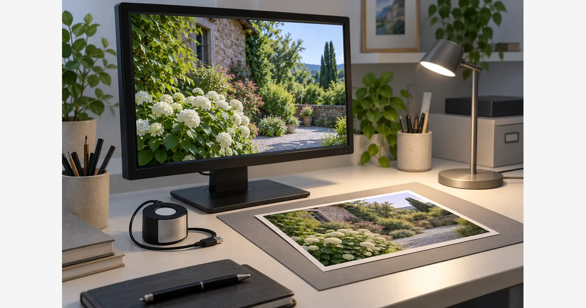
If your photo prints look too dark, first check the light on the print and the screen used to edit it. Then check the file, paper, and color-management path. An overly bright screen can encourage edits that look darker on paper, but it is only one possible cause.
Keep an untouched original and change one variable at a time. If the result includes banding, missing colors, or uneven areas, start with the printer manufacturer's diagnostic guidance. A brightness adjustment is not a reliable fix for a mechanical or ink-delivery problem.
Start with the symptom, not a brighter edit
| What you notice | Check next | Avoid changing first |
|---|---|---|
| The print looks acceptable in good light but dark in its display location. | Lighting on the paper, reflections, and the intended viewing conditions. | Every photo's exposure. |
| Several familiar files look dark compared with a bright screen. | Monitor brightness/profile, room lighting, and the output workflow. | The master files in bulk. |
| Only one file looks wrong. | The submitted version, embedded profile, edits, and any automatic corrections. | The whole printer setup. |
| A problem began after changing paper or ink. | The media setting, supported combination, and matching output profile. | A universal brightness or gamma offset. |
| There are bands, gaps, or missing colors. | The manufacturer's printer diagnostic and maintenance instructions. | Color edits intended to hide the defect. |
Write down which case fits best. A known, unchanged image printed through a recorded workflow is a more useful reference than an unfamiliar downloaded image.
Check the light on the paper and the editing screen
A display emits light; a print is viewed using the light falling on it. Compare the print in a consistent, adequately lit viewing area and also in the location where it will be displayed. Keep reflections off the monitor. Adobe's printing-workspace guidance treats display setup, ambient light, and paper as parts of the same workflow.
If the screen is set very bright or changes automatically as the room changes, it can mislead editing decisions. Use a calibration/profiling workflow appropriate to your display and print-viewing environment. There is no universal screen brightness percentage that means the same measured output on every monitor.
Once the display is profiled, keep the relevant display settings and viewing conditions stable. Recheck the profile if you change them. Our monitor calibrator comparison is a place to check device support; owning a calibrator is not proof that its profile is current or selected correctly.
Do not adjust the monitor merely until it matches a print made with unknown settings. That can conceal a wrong output configuration. X-Rite explains the role of output and monitor profiles when comparing a display with a print.
Follow the path that matches how you printed
If a lab made the print
- Check the exact file you submitted, including its edits and embedded profile.
- Read the lab's requested file format and color space. Ask whether automatic image correction was enabled.
- Confirm the exact paper/finish, size, border, and crop. Compare with the order preview.
- Ask which soft-proof profile, if any, belongs to that product. A profile for another paper or process is not a substitute.
- Send the lab a concise record of the file, product, settings, and viewing conditions before placing a large replacement order.
You do not control the lab's printer driver. Instructions to disable driver correction apply to a suitable local printing workflow, not to a lab order menu you cannot inspect.
If you printed at home
Check that the paper is supported, loaded on the correct print side, and selected using the appropriate media setting. Use the printer and paper documentation for the actual combination. For a new output device, our photo printer guide can help compare features, but replacing hardware is not the first diagnostic step.
Then choose one coherent color-conversion workflow. Adobe's current Photoshop printing instructions distinguish these two routes:
| Route | Application | Printer driver |
|---|---|---|
| Application-managed conversion | Select the matching printer/ink/paper profile in the application's managed-color workflow. | Use the documented setting that prevents a second color conversion. Keep required media and quality settings correct. |
| Printer-managed conversion | Choose the workflow that lets the printer manage colors. | Use the appropriate documented driver color-management and media settings. |
Do not mix instructions from the two rows. Menu names vary by printer, driver, operating system, and application. Record which component is performing the output conversion; do not simply turn off every color-related setting. Also distinguish a document's source profile from the printer's output profile.
Use soft proofing for the intended output
A soft proof previews an output condition using a suitable profile. Choose the profile for the actual print product, with the application settings recommended for that workflow. Options that simulate paper white or black ink can change the preview. Adobe's print-preparation guidance describes these controls.
Use the preview to identify a possible output limitation, then verify with a physical sample. A profile does not make a screen emit exactly the same appearance as reflected light from every paper under every lamp. If the correct profile is unavailable, a small controlled print and the supplier's guidance become especially useful.
Paper finish also changes what you see under different angles of light. The glossy vs matte comparison includes a sample-selection routine. Keep paper choice separate from the question of whether a particular file or workflow is wrong.
Make one controlled test print
Download the dark-print troubleshooting log (.txt)
- Keep a baseline. Save the submitted file and all current settings. Preserve the original separately.
- Choose one change. For example, correct a confirmed media setting or use the proper managed-color route. Do not simultaneously change the file exposure, paper, and output profile.
- Print a useful sample. Keep enough size to judge the areas that matter. Follow the paper's handling and stabilization instructions before comparing.
- Use the same viewing conditions. Record the light and position. Compare both the new print and the retained baseline.
- Decide from the result. If the workflow is now consistent but a creative adjustment is still needed, make a separate print version and test again.
Keep details about file version, source profile, paper, media setting, profile/driver route, automatic correction, date, and observation. A small log makes the next attempt informative rather than another guess.
If the problem persists across known files with the documented setup, take the log to the lab or printer support. If you find banding or missing colors, return to the manufacturer diagnostics rather than applying repeated heavy cleaning or increasingly bright edits. Use the print-size calculator for dimensions and cropping; it cannot diagnose print tone.
Sources
Frequently Asked Questions
-
First check the output and viewing workflow. If a consistent process still calls for a creative adjustment, make a separate print version and proof it. A blanket brightness change can hide the actual problem and alter files that were already suitable.
-
It can mislead editing decisions or make a reasonable print look dark by comparison. Check monitor profiling, brightness, ambient light, and print viewing together. A bright screen is not the only possible cause.
-
Use the documented route for your setup. An application-managed route uses the relevant output profile and prevents a second conversion in the driver. A printer-managed route lets the driver handle conversion. Do not combine settings from both routes or turn every color control off.
-
Calibration/profiling can address display inaccuracies, but it does not correct every file, paper, driver, printer, or viewing problem. Check the full path and verify it with a physical sample.